🚀 Retention Challenges - Swiggy's Battle with the Paradox of Choice
Sharing my take on the “WhatToEat” feature from Swiggy - covering the thought process around what problem this feature is solving for & which business metric it might be driving.
About Swiggy
Swiggy is an on-demand convenience platform in India, which started with “Food delivery” and then eventually expanded into qcommerce referred as “Instamart”, diner reservations at restaurants via “Dineout” and pickup & delivery of items within the same city called “Swiggy Genie”
What makes Swiggy stand out is how well all these four business lines are integrated on the app, creating a unified & seamless user experience. This is making Swiggy part of the most popular one stop destination for online food ordering, groceries, dining, pickup & delivery.
User Segmentation for Swiggy
- Consumers: The ones engaging with the app to place the goods request
- Delivery Partners: The ones making the deliveries from vendor to the consumer
- Restaurant/Vendor Partners: The ones providing the goods be it food, groceries or a table at the restaurant
The WhatToEat feature which I will deep dive on falls under “Food Delivery”, so our users will be Consumers, Delivery Partners and Restaurants.
Diving into Swiggy’s “WhatToEat”
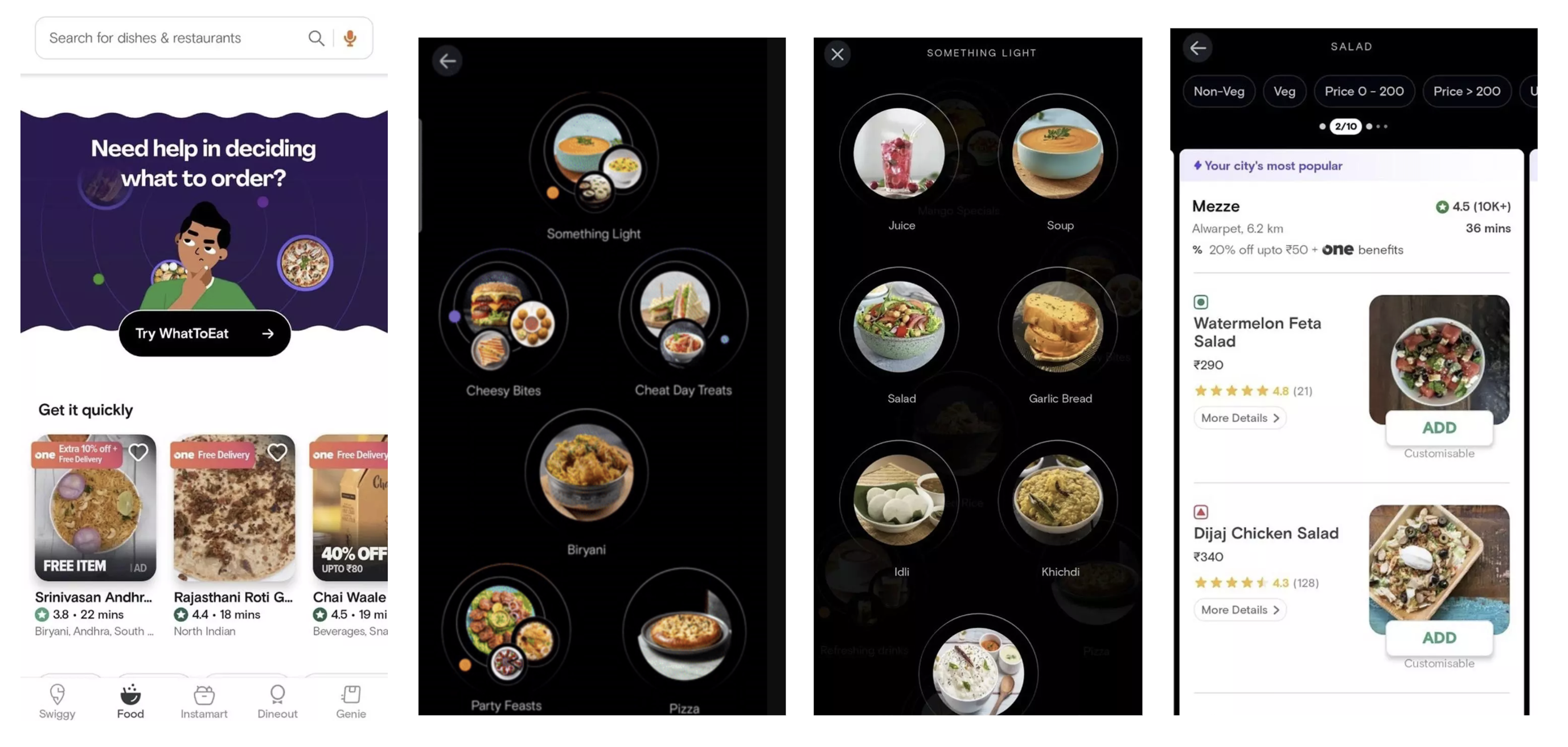
The “WhatToEat” feature launched in 2023 looks like the below images, as per Swiggy’s blog the feature is focused to help users order food attuned to their moods and cravings.
How does it work?
- Click on the banner of “Try WhatToEat”
- Find bubbles displaying different possible moods a user might have
- Select one of the options for eg. somewhat light
- Select the options for the bubble options falling under the “Somewhat light” category
- You will find a list of 10 food recommendations on basis of your selection

This AI powered food delivery feature focused on giving personalized recommendations to Consumers with intention of simplifying their decision making.
But why did Swiggy built it?
What does it solve for for their users?
If we think about our users, this specific solution focuses on “decision fatigue”. Swiggy has a lot of restaurants, hence a lot of options for the users which is great because it can appeal to a lot of people. However, the greater the number of choices, the more chances people won't make any.
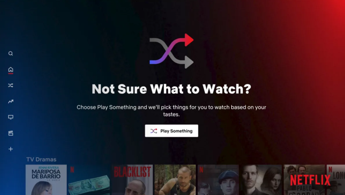
This is a common problem across platforms with vast content, like Netflix, Youtube. There have been so many times I opened Youtube, only to end up watching trailers after trailers?
Netflix approached this problem by “Play Something” feature in 2021.

Coming back to Swiggy, their new design is aiming to help save a ton of time for users by finding food options based on their choices. This real time personalization makes it easier for users to make a decision.
What does it solve for Swiggy?
The driving factor here is “Revenue”, well everything any company does & should eventually lead to revenue, be it directly or indirectly.
However, here the focus is on “Preserving Revenue” ie. Retention.
In long term say over a week or month,
- More decision fatigue, means less number of orders being placed
- Less the number of orders being placed mean Less engagement of users on the app
- Less engagement, means high chances of users abandoning the app ie. low retention
& in short term, it’s simply leading to high churn rate again impacting the day to day retention.
Hence solving for the “decision fatigue” by addressing the “Paradox of Choice” does seem to be a good lever to pull.
Where is WhatToEat feature now?
The feature seems to have discontinued and is not available on the latest version now. The possible reason may be low engagement with the feature. But where is this assumption coming from? Let’s go back to Netflix’s “Play anything” feature - this feature was gradually sunset by starting of 2023- why? Low Usage! The hypothesis which Netflix had for low usage was even though initial engagement was high in longer run users resort to browsing for videos in certain categories, such as horror or romantic comedies, rather than bet on the shuffle mode surfacing enticing content.
So I am thinking there might have been some overlap between the two.
So what may have been possible failure areas for “WhatToEat”
Even though the solution here was well thought out given as a lot of players had tried it, I did notice some things which may have lead to long term adoption failure:
- Expectation Gap: On coming across “WhatToEat” feature users might have expected direct and more personalized suggestions, specially if they are a existing user and have engaged with apps like Netflix. But on click it seems like a different visual experience of same food categories they already see on the app with some added mood-related options. This gap may have led to some disappointment
- Subjected to same fatigue it is trying to solve for: Personalization works best when we have a lot of data to streamline & reduce choices for the user as per what they might prefer, but adding two new layers of selecting the “mood” with multiple mood options and then the sub-decision in itself adds more decision user needs to make, which may add to the fatigue
- Stagnant mood options may lead to dip with time: When users use this feature for the first few times, the mood options are new and refreshing, users are psyched hence we see high engagement, but as the time goes and the options start seeming constant, users loose interest and fall back to their original habits.
Conclusion
In reality, there might have been more nuances to it - in terms of depth and breadth of why it failed and what exactly happened, but as a Product Manager observing from the outside this does seem like a good possibility.
The “WhatToEat” feature is a good reflection of how audience’s interest is short lived and that’s what makes retention the biggest challenge today.
So, when devising a strategy or solving for a problem - it’s important to consider how to keep users psyched in short term as well as in the long term and ensure we are running thorough and continuous experiments to keep going through the cycle of failing fast & learning faster.